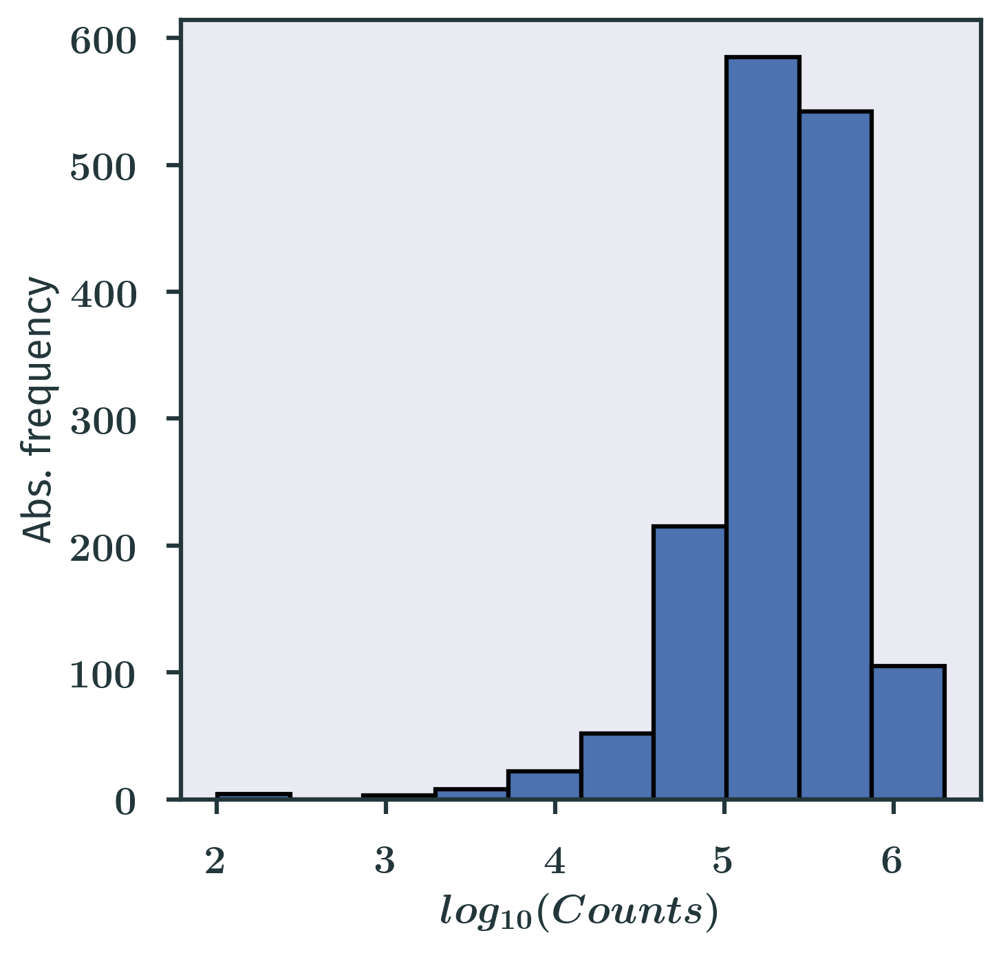
Lecture 2 started to introduce some basic techniques in descriptive statistics. You can think of this lecture as a recap of what you have already known in the past. Make sure you get familiar with all the graphs introduced in this lecture, because we are going to use them all the time in future lectures. Perhaps the most important graph in this course is the histogram, which is the most common way of showing frequency distributions:

When we say “let’s look at the distribution of the data”, most of the time we just mean looking at the histograms of the data we’ve got. Note that I am using the plural form histograms here, because for some data we need to make more than one histogram with different bin sizes to get an idea about our data. Make sure you understand how histograms are generated and the pros and cons of them.
There is no homework today, but please have a look at the practice section below. Can you answer those questions? How do you solve the problems? Is it easy or difficult to do? We will discuss the ways of solving those problems later on. Hopefully, through BIO210, you will also gain some practical skills in terms of text file manipulation, which is actually quite important but missing in many courses.
- A series of publications in 2008 (Nagalakshmi et al. Science, Wilhelm et al. Nature, Mortazavi et al. Nature Methods, Lister et al. Cell, Cloonan et al. Nature Methods, Marioni et al. Genome Res., Morin et al. Biotechniques) marked the start of a new technology: RNA-seq, a method that can profile the whole transcriptome of a sample. Let’s look at the Mortazavi et al. paper published in Nature Methods. Go to the journal page of the paper by clicking here. Scroll down to the “Supplementary Information” section, and download the “Supplementary Dataset 1”, which is a tab-delimited file that you can open with Excel (be careful NOT to save in Excel, though!) or whatever suitable programs you like. Look at the 6th column named ‘finalRPKM’. This column contains the values of the expression of all the genes in the human genome in that specific sample. Can you plot the distribution of those values using a graph or table we introduced during the lecture? What are the smallest/largest values, the median and the lower/upper quartile? Do you see any patterns in the graph or table you just created?
- I have compiled some information of all annotated human genes from the Ensembl database (time stamp: 2022-02-14T16:59:00+08:00). You can donwload the zipped file from here. If you unzip it, you will find a tab-delimited file again. Each row describes a gene, and the meaning of each column is indicated in the header (the first row). Scientists have categorised all genes into different types (the 3rd column). Can you figure out how many types of genes are there? How many genes are there in each type? Here we only care about all the “protein_coding” genes. The length of those protein_coding genes can be simply computed by Gene end (bp) - Gene start (bp) + 1. Once you computed the lengths of all genes, look at the first digit of those numbers. Of course, the first digit can only be 1 - 9. Can you created a frequency table or bar chart to show the absolute frequency of each digit?